Analysing Test Results
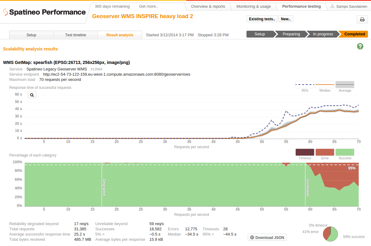
Analysis of all the test requests made during the test is calculated automatically as soon as a test is completed. The results of the scalability analysis are shown on the Result analysis tab. It shows two graphs for each meter included in the test: response time and the success/fail ratio compared to the request rate at the time of making a request.
Response Time Scalability
Response time scalability during the ramp-up indicates how well the service reacts to the increasing request rate. The ideal behavior would be a linear growth of the response time compared to the increasing request rate: the more requests the service needs to handle in the same period of time the longer it takes to respond to each of them. Exponential growth indicates a problem in scalability: each step in increased request rate makes the request handling slower than the previous one did. In both cases the resources are bound to run out at some when the load is increased. The scalability graph only shows the measured response times of the eventually successful requests. This enables you to see how the service handles serving the successful part of the requests when there is no longer resources for handling all incoming requests.
It’s good to notice that the horizontal axis is the request rate at the time of creating the requests. For tests that have a ramp-up time equal to the length of the test this axis is equal to the time axis shown in the test timeline. For tests the have a shorter ramp-up followed by a constant request rate period, the last data point (maximum load) contains a much bigger sample of requests than the ones before. This is intentional, because the intention of this visualisation is to show the scalability of the service with the increasing load. The number of requests with statistic distribution for response times are shown in the mouseover tooltip for the graph.

The scalability analysis is available on the “Result analysis” tab after the test
has finished. The graphs show the measured response times and success/error ratio
compared to the request rate at the time of starting these requests.
Success, Error And Timeout Percentages
The lower graph shows the fractions of the requests made at each request rate ending in success, error and timeout. The vertical scale is relative: data points at each horizontal axis point indicate successfulness ratio of all requests created during the test at times when new requests were made at the certain rate. Thus 10% percent error indication at 10 requests/s means the on the average one of the 10 requests made during at that particular second of time of the ramp-up ended with error when it was eventually finished. The same 10% error indication at 50 requests/s point would mean 5 of the requests made during that second
of ramp-up failed in the end.
In the test shown in the screenshot above the scalability of the successful requests for the service is linear between the 48 and 60 request/s. After 60 the successful request response time becomes almost flat and service starts to produce a considerable amount of errors. Service still succeeds in serving a nearly constant 30 successful requests/s with average response time of about 39s to the end of the test. This is a sign to good overload handling design, because it means that the service remains partly functional even in overload situations.
Downloadable test results
The analysis results can be downloaded as a machine readable JSON file. Machine readable files can be easily used in scripts and other software. This helps you compose your own test reports with accurate numbers.
Updated less than a minute ago
